An institution.
The School is credential-grade design: a seal, a certificate, a numbering system, and the recorded serif allowance. A school signals permanence through type and structure, so structure here is stated exactly, never implied.
What this door owns.
The three doors are told apart by temperature and proportion, not by three separate palettes, so the house still reads as one house. This is what School of the Local Church owns.
| Ground | Word Blue structure on Parchment. |
|---|---|
| Type | Parchment on Word Blue. The most typographic door, with the recorded serif allowance for credentials. |
| Flame | 5% ceiling. Structure carries it, not colour. |
| Register | A building. Ordered, sequential, institutional. |
| Avatar | The seal, Parchment on Word Blue, once it is approved. Until then, the parent wordmark on Word Blue. |
| Handle | @schoolofthelocalchurch, recorded in the Channels section of this guide. |
| Endorsement | Every surface carries the line A ministry of THE WORD FOR ALL THE WORLD. It is not optional. |
Why this door exists.
TRAIN is the third movement, and the one that lasts. Fire that is not trained goes out. This door teaches believers their authority in Christ and how to build a real relationship with Jesus, starting with the free personal evangelism course.
Structure, stated exactly.
"Structure carries it" is measurable here, not a mood. The School's structure is a numbering system, a certificate, and the recorded serif allowance.
- The serif allowance. Credential and course titles in DM Serif Display, diploma text in DM Serif Text, recorded in Brand Guide §11. The only door permitted the parent's serif. Body copy, labels, and interfaces stay DM Sans.
- The numbering system. Courses are numbered from SLC 101 upward, and inside a course the unit reads Module 04 · Session 3. If it can be a sequence, it is one, and the numbers are stated exactly, because a school that is vague about its own curriculum is not a school.
- The certificate. Letterhead paper, the student's name in serif, the course number and name, the completion date from the record, the two signatures, and the seal. Nothing else.
- The wax. A presented credential may carry the physical seal, pressed in deep Ember-red wax or blind embossed. Wax is for the School's own credentials only.
Documentary capture, from the record.
Real moments from real ministry. Nothing stock, nothing staged, nothing generated. Every published photograph carries a caption in the record register.
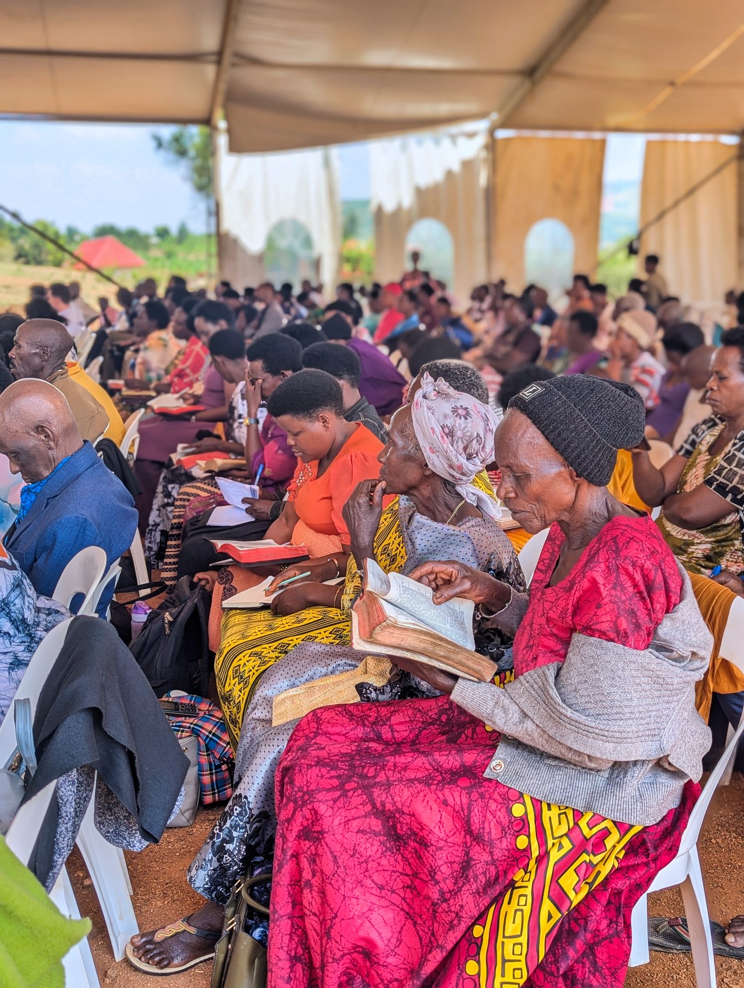
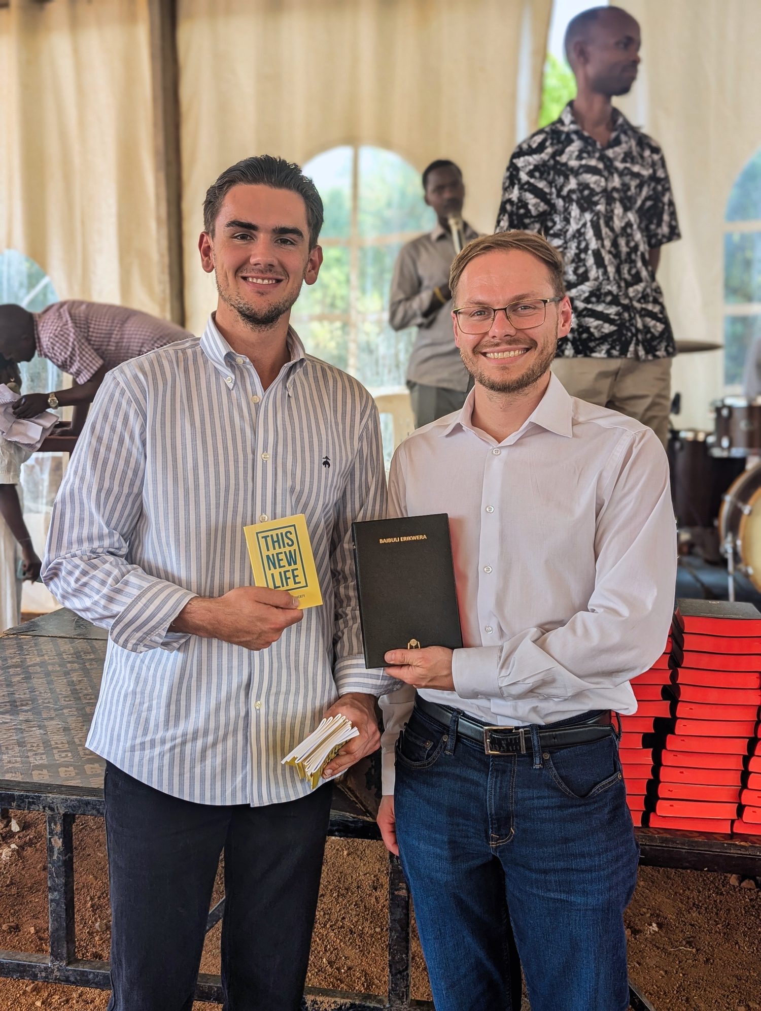
Dates come from the capture record. The location is recorded as Sanga, Mbarara, Uganda in the capture folder and is pending confirmation against the official ministry record, so it is stated here and not yet frozen into the guide.
What this door still needs shot.
Today all three doors draw from one conference, so the three guides read as three views of one event. Three ministries need three libraries. These are the shots this door records next, and the brief is recorded as a gap in the asset record.
- The classroom. Teaching sessions, open Bibles, pens moving.
- The materials. The course books and Bibles as objects, received and used.
- The credential moment. Graduates with certificates, named and consented, for the record.
A crowned lion, and a ground that does half the drawing.
The mark is the Lion of Judah wearing a crown, beside School in the house serif over OF THE LOCAL CHURCH letterspaced in DM Sans. It is two tones and no more: the lion’s is Midnight over White, and the name beside it is Word Blue. The horizontal lockup is the one exception: on light grounds its lion takes Word Blue too, so that mark reads as a single colour. The interior is not painted on, it is left open, so the ground shows through it. One drawing therefore reads on Parchment, on Word Blue, and on Midnight alike, with only the name flipping to white on the dark ones. Nothing is redrawn per ground.






The editable original lives at https://canva.link/5577z0y930kvzam. Changes start there and come back through the inbox, because the published files are generated and a hand edit to one of them is overwritten by the next build.
Where this door is found.
One label per platform, read the way an ingredients panel is read. This door opens an account only on the platforms its kind of brand needs, so no channel goes quiet. Anything not listed is carried by the parent, whose own channel facts live in Brand Guide §12.
| Home | a named page under theword.world |
| YouTube | @schoolofthelocalchurch |
| @schoolofthelocalchurch | |
| schoolofthelocalchurch | |
| X | carried by the parent |
| TikTok | carried by the parent |
These handles are the recorded standard, not a claim that every account exists. Registration status is pending confirmation against the account record. A handle that cannot be secured on a platform comes back here through a changelog entry, never as an improvised variant.
Where this door departs.
Everything in the Brand Guide applies here. These are the points where School of the Local Church is deliberately not the parent.
- Structure carries the weight. Word Blue blocks, rules, and numbered sequence do the work that colour does elsewhere.
- The serif allowance. The only door that sets type in the parent's serif: credential and course titles, certificates, and diploma text, per Brand Guide §11. Everything else stays DM Sans.
- The seal. The only door that carries one. Single colour, the School's own credentials only, never another door's work, never decoration.
- The most typographic door. Sessions, modules, and steps are numbered and ordered. If it can be a sequence, it is one.
- Flame at five percent. A school is not a rally. The fire is in what is taught, not in the layout.
- Everything is a record. Course names, session numbers, and dates are stated exactly, because a school that is vague about its own curriculum is not a school.